Data Stories
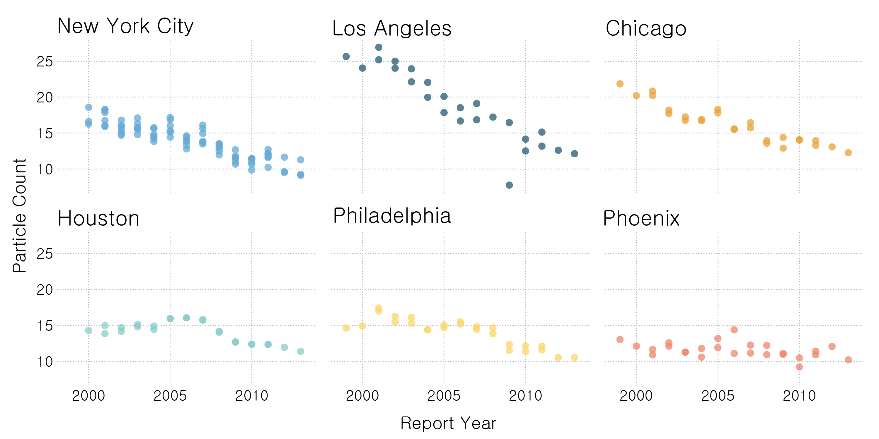
Actual "fresh air" is scant during summer National Park visits
Air pollution measurements in the United States' national parks show that air pollution levels peak during summer months, along with national park visitor traffic. Data analysis completed with Python/ pandas, accompanied by matplotlib and Illustrator visuals.
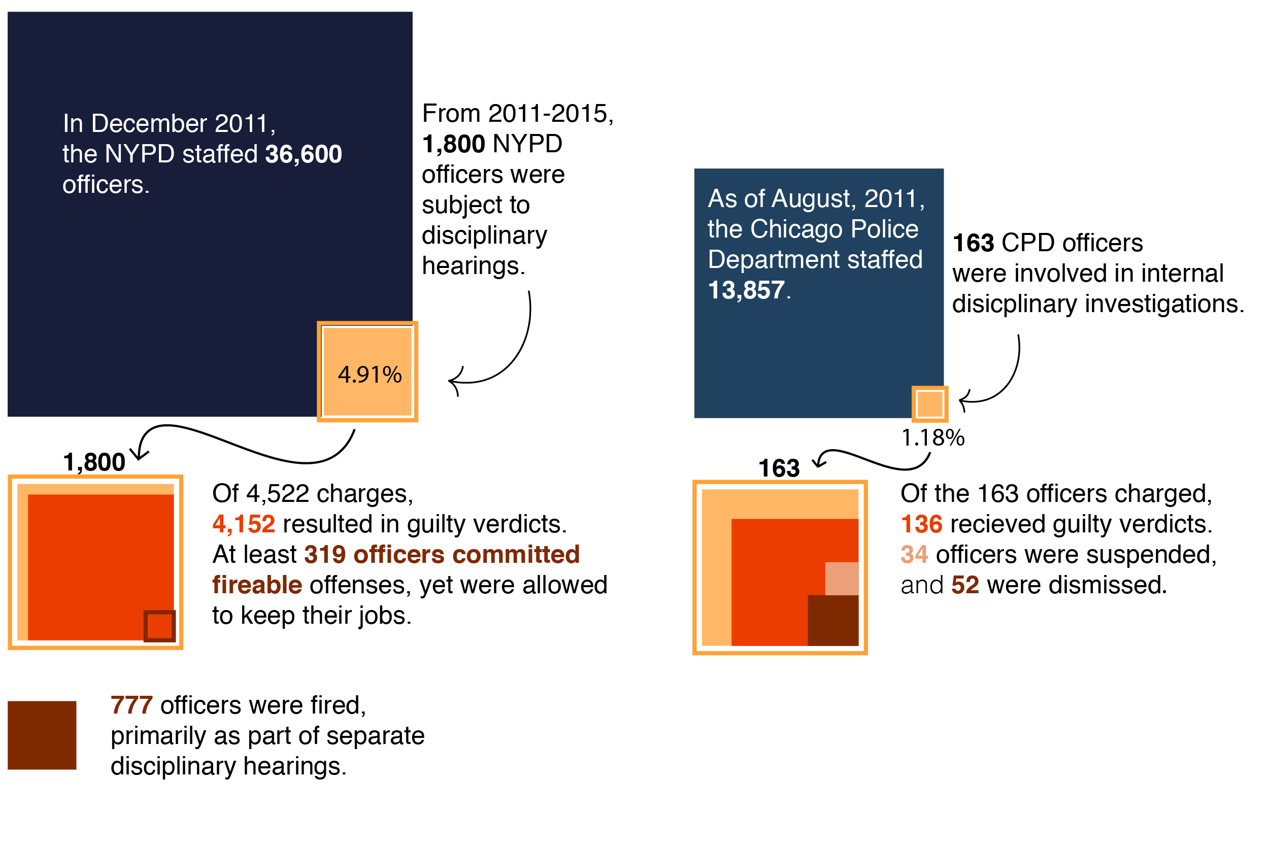
How do New York City and Chicago discipline their delinquent police officers?
The New York City Police Department and the Chicago Police department, two of the largest police departments in the country, differ drastically in their approach toward officer discipline. They also differ in their policies regarding publicly-available information.
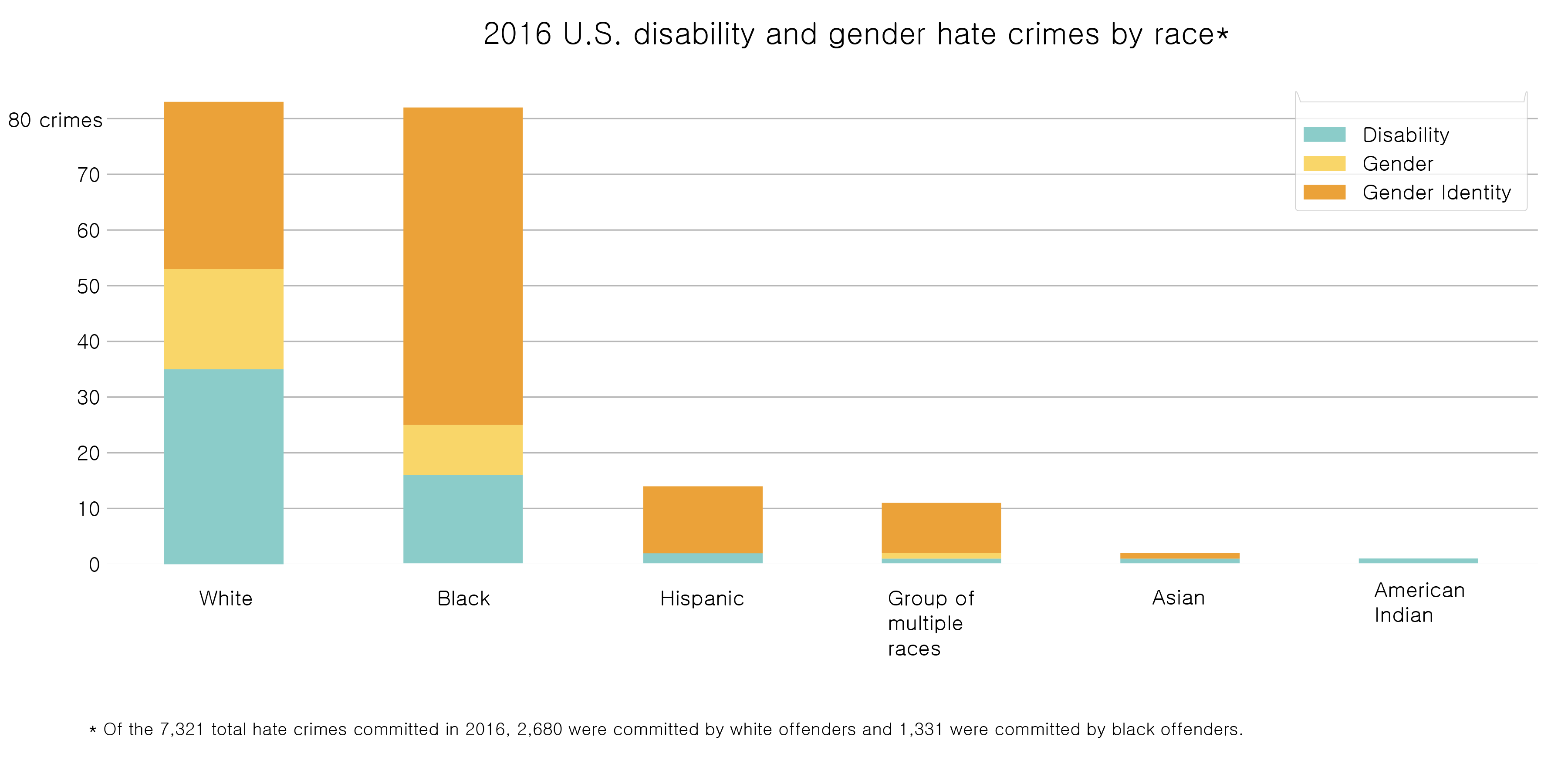
What we can learn from the United States' uptick in hate crimes
A look at the FBI's 2016 annual hate crime data, with a focus on gender and disability-motivated crimes. Visuals created with pandas, matplotlib, and Illustrator.
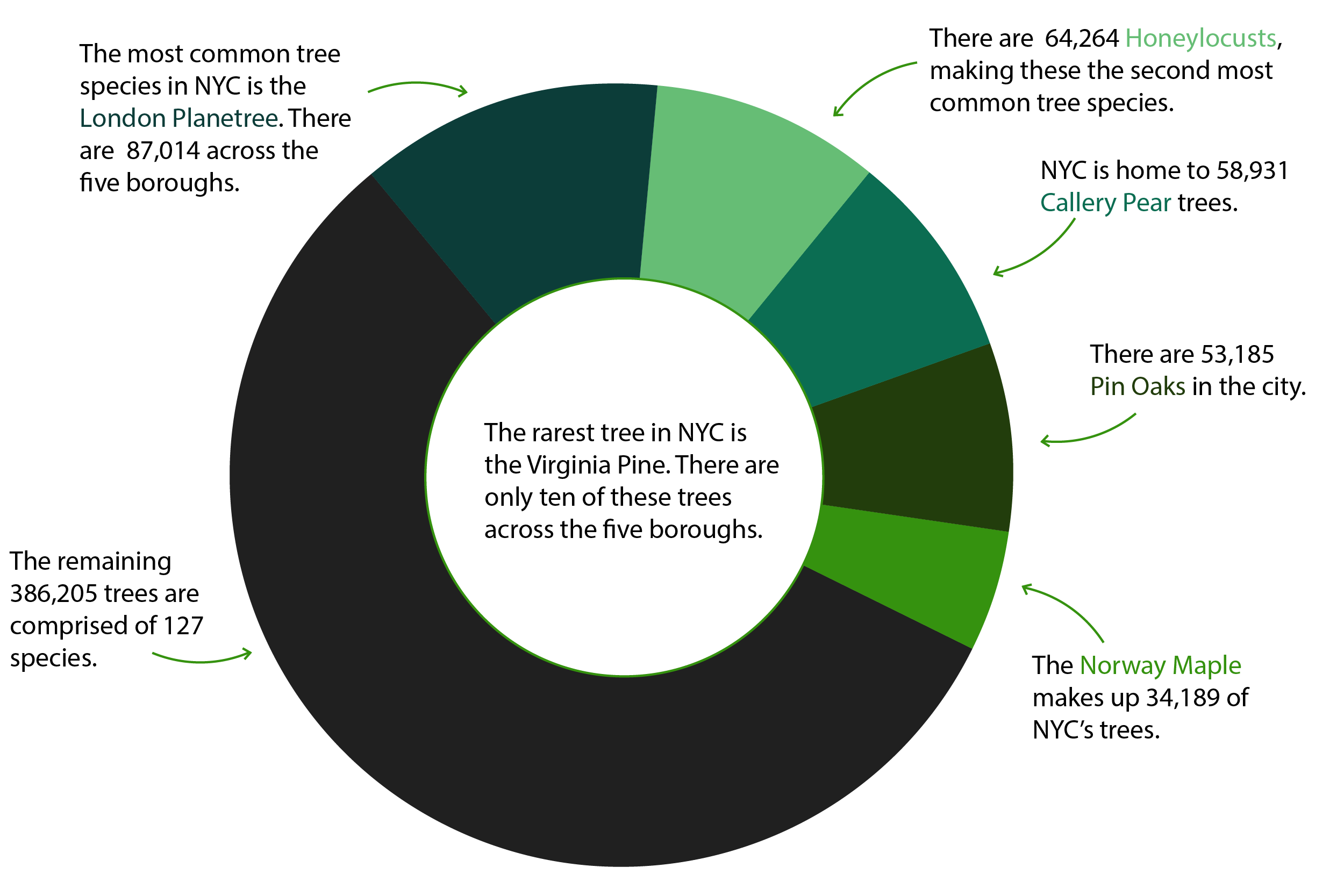
NYC Street Trees
Every five years, the New York City Parks Department collects data on the city's trees. I analyzed 15 years of data using pandas and created visuals using matplotlib and Illustrator.
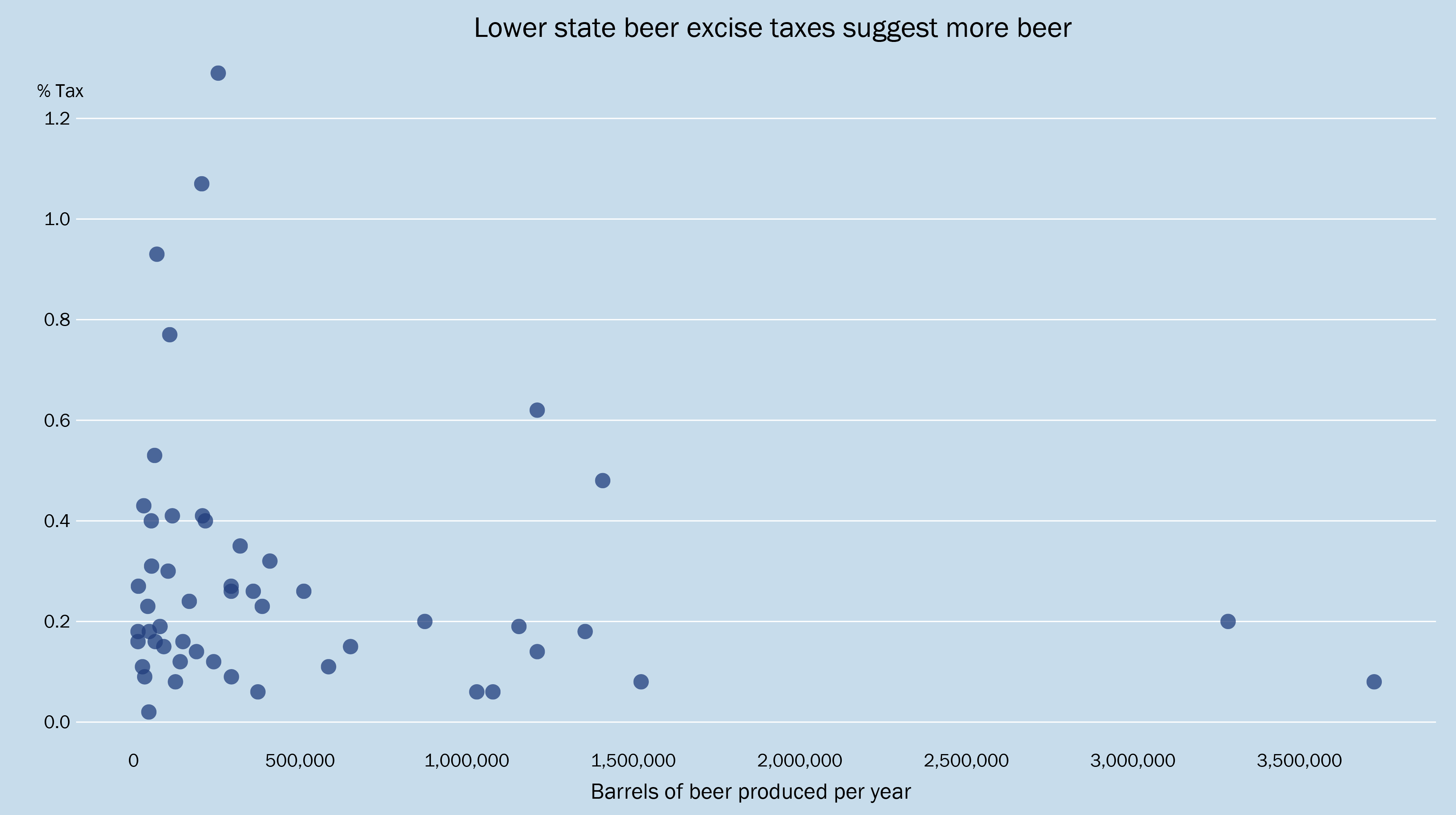
Top U.S. States for Craft Beer
I scraped the U.S. Brewer's Association website for information on each state's beer production, alcohol excise tax, total breweries and breweries per capita. I also used Selenium to scrape information on each individual brewery, then ran the addresses through Google's API to fetch coordinates and map each brewery in QGIS.
D3 Vizualization
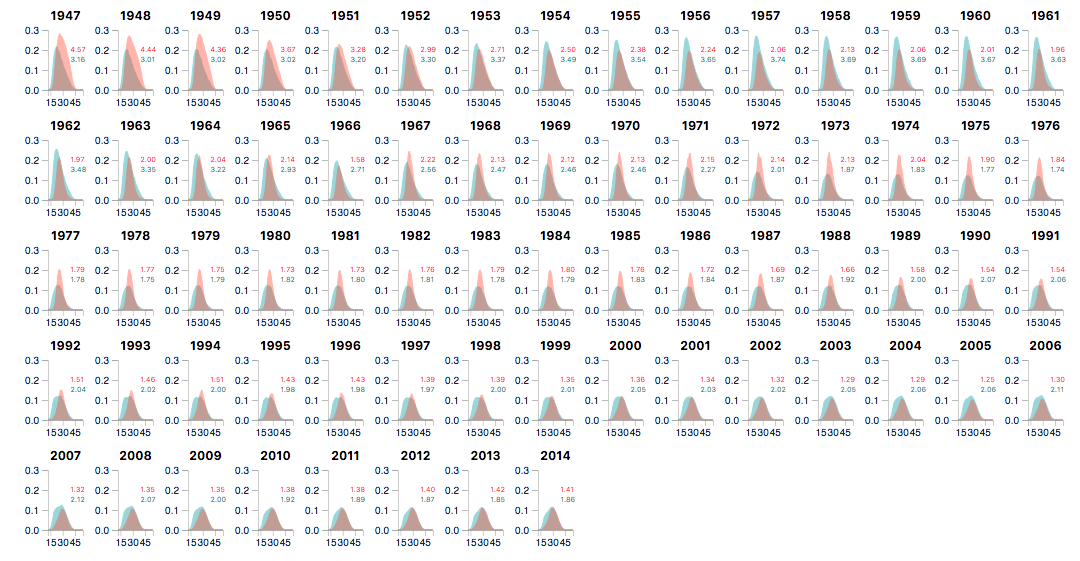
Charts in D3 - Coursework
Example of charts, nesting and small multiples in d3.js.
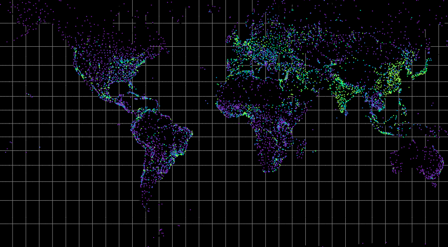
Mapping in D3 - Coursework
A map of the world's cities, international flight visualization, and a hex map.